Template Details
One of hottest features in JSN Decor is extended styles adapted for 5 most popular Joomla! extension: K2, Community Builder, Virtue Mart, JEvents and JoomGallery.
Technically extended styles are overrides of default extensions style (images + CSS) and located in folder /ext inside template folder. Some extensions have their own template system and you might want to turn off extended style thru template parameter in order to use those native templates.
The extensions discussed here are not included in the template package and you have to download separately. You can download the extensions on Joomla! Extensions Directory http://extensions.joomla.org/
K2
Extended style for K2 includes adapted tabs color, additional module styles, fixed alignment issues and some other minor visual enhancement.
Component styling
Here is how K2 component will look like after extended styles applied.

Module styling
Besides from extended component styling you can use template module styles for K2 modules as well.

- K2 Content Module (mod_k2_content) with module style box-green jsn-icon-article applied

- K2 Comments Module (mod_k2_comments) with module style box-blue jsn-icon-comment applied
- K2 Login Module (mod_k2_login) with module style box-yellow jsn-icon-user applied
Community Builder
Extended style for Community Builder includes adapted dropdown menu style, tabs color, additional module styles and some other minor visual enhancement.
Component styling
Here is how Community Builder component will look like after extended styles applied.

Adapted drop-menu style and tabs color on CB Profile page
Module styling
Besides from extended component styling you can use template module styles for Community Builder modules as well.

In the example above:
- CB Login Module (mod_cblogin) with module style box-yellow jsn-icon-user applied
- CB Online Module (mod_comprofilerOnline) with module style box-blue jsn-icon-online applied
- CB Workflows (mod_comprofilermoderator) with module style box-grey jsn-icon-selection applied
Virtue Mart
Extended style for Virtue Mart includes adapted Add to Cart button, additional module styles, fixed alignment issues, redesigned checkout-steps icons and some other minor visual enhancement.
Component Styling

Fixed alignment issues on Product Details page
Module styling
Besides from extended component styling you can use template module styles for Virtue Mart modules as well.

- VirtueMart Module (mod_virtuemart) with module style box-blue jsn-icon-cart applied.
JEvents
Extended style for JEvents includes redesigned calendar navigation icons and calendar table, adapted table header color, additional module styles, fixed alignment issues and some other minor visual enhancement.
Component Styling

Totally redesigned calendar navigation icons

Adapted calendar table header color

Adapted table header color on Event List page
Module styling
Besides from extended component styling you can use template module styles for JEvents modules as well.

In the example above:
- Events Calendar Module (mod_jevents_cal) with module style box-blue jsn-icon-calendar applied.
- Latest Events Module (mod_jevents_latest) with module style box-green jsn-icon-star applied.
- JEvents Legend Module (mod_jevents_legend) with module style box-grey jsn-icon-info applied.
JoomGallery
Extended style for JoomGallery includes redesigned navigation icons, fixed alignment issues, additional module styles and some other minor visual enhancement.
Component Styling

Totally redesigned navigation bar and information panel

Fixed alignment issues
Module styling
Besides from extended component styling you can use template module styles for JoomGallery modules as well.

- JoomSearch Module (mod_joomsearch) with module style box-blue jsn-icon-search applied.
- JoomGallery Treeview Module (mod_jgtreeview) with module style box-yellow jsn-icon-image applied.

- JoomGallery Latest Categories Module (mod_jglatestcart) with module style box-grey jsn-icon-star applied.
- JoomGallery Stats Module (mod_joomgallerystats) with module style box-green jsn-icon-statistics applied.
One of the fastest and easiest ways to learn template is to install sample data and start playing with it. JSN Decor provides unique mechanism of installing sample data directly on your current website. Just few steps and the demo website is here.
Step 1. Setup sample data
Go to template settings page and click button "Get started".

There are 2 options for you to choose: Install sample data directly on your site or download the quickstart package and use it as standard Joomla site.
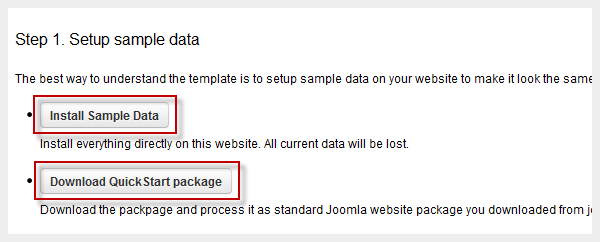
The installation process would start instantly and you would get the website in less than a minute.
Step 2. Read template documentation and start playing
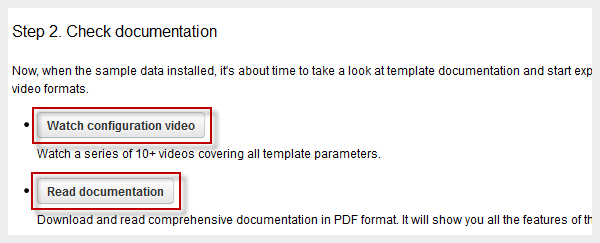
Done! Just 2 simple steps and you have sample data installed.
Now it's time to read documentation and play with the template. You can download documentation package for free.
At JoomlaShine.com, we put great efforts in optimizing our templates performance by multiple techniques like image sprites application, clean html code output and now one new step – CSS/JS Compression.
What it does is to combine all CSS/JS files into a single file and deliver it in GZIP compressed state to browser. This feature significantly reduce http request number to server as well as overall loading size, which results in 35% performance boost.

Before enabling CSS/JS compression

After enabling CSS/JS compression
CSS/JS Compression feature is enabled on this demo website. You can check the source code to see how it works.
Custom CSS File(s)
This feature allows you to load multiple custom CSS files among with template default files. This feature is very useful, when you have special dedicated CSS file for content styling.

Custom CSS files are loaded among with other template CSS files
Just put custom CSS files to template's CSS folder and define them in template parameter Custom CSS File(s) each file name at a line. If you enable CSS/JS Compression feature, all custom CSS files will be compressed as well.
Documentation
JSN Decor is equipped with very comprehensive documentation package that will help you with template utilization.
Configuration Manual
This PDF document gives you detailed description of every template feature. You can print and use this document as a reference every time you want to configure your template. You also can watch our play list JoomlaShine Template Configuration.Customization Manual
This PDF document gives you easy-to-understand instruction how to customize template elements to make it suites you or your client. You also can watch our playlist JoomlaShine Template Customization.
Support
Technical support is available for everyone who use our products via Support Forum. Here you will find forums for FREE and PRO editions owners and get support from our support team as well as thousands of active members.
When purchasing our products you are backed up with professional and timely support, 12-hour response time is guaranteed for PRO editions owners only.
JSN Decor was developed with extreme focus on typography and we believe it provides the most comprehensive content presentation capability. Headings, text, links, tables, images, everything was designed with high level of refinement. Let's take a look.
Headings
This is an H1 Header
Lorem ipsum dolor sit amet consectetuer eleifend elit vel tellus laoreet. At ut pellentesque risus quis sem eros et consequat enim lorem. Aenean lorem consequat consequat eu.
This is an H2 Header
Lorem ipsum dolor sit amet consectetuer eleifend elit vel tellus laoreet. At ut pellentesque risus quis sem eros et consequat enim lorem. Aenean lorem consequat consequat eu.
This is an H3 Header
Lorem ipsum dolor sit amet consectetuer eleifend elit vel tellus laoreet. At ut pellentesque risus quis sem eros et consequat enim lorem. Aenean lorem consequat consequat eu.
This is an H4 Header
Lorem ipsum dolor sit amet consectetuer eleifend elit vel tellus laoreet. At ut pellentesque risus quis sem eros et consequat enim lorem. Aenean lorem consequat consequat eu.
This is an H5 Header
Lorem ipsum dolor sit amet consectetuer eleifend elit vel tellus laoreet. At ut pellentesque risus quis sem eros et consequat enim lorem. Aenean lorem consequat consequat eu.
This is an H6 Header
Lorem ipsum dolor sit amet consectetuer eleifend elit vel tellus laoreet. At ut pellentesque risus quis sem eros et consequat enim lorem. Aenean lorem consequat consequat eu.
Text columns
You can arrange content in multiple columns by using very simple html code. JSN Decor will detect the amount of columns you defined and automatically make arrangement.
Usage: <div class=”grid-layout”><div>Text in column 1</div><div>Text in column 2</div></div>
Content arranged in 2 columns
Text column
Lorem ipsum dolor sit amet consectetuer eleifend elit vel tellus laoreet. At ut pellentesque risus quis sem eros et consequat enim lorem. Aenean lorem consequat consequat eu.
Text column
Lorem ipsum dolor sit amet consectetuer eleifend elit vel tellus laoreet. At ut pellentesque risus quis sem eros et consequat enim lorem. Aenean lorem consequat consequat eu.
Content arranged in 3 columns
Text column
Lorem ipsum dolor sit amet consectetuer eleifend elit vel tellus laoreet. At ut pellentesque risus quis sem eros et consequat enim lorem. Aenean lorem consequat consequat eu.
Text column
Lorem ipsum dolor sit amet consectetuer eleifend elit vel tellus laoreet. At ut pellentesque risus quis sem eros et consequat enim lorem. Aenean lorem consequat consequat eu.
Text column
Lorem ipsum dolor sit amet consectetuer eleifend elit vel tellus laoreet. At ut pellentesque risus quis sem eros et consequat enim lorem. Aenean lorem consequat consequat eu.
Content arranged in 4 columns
Text column
At ut pellentesque risus quis sem eros et consequat enim lorem. Aenean lorem consequat consequat eu.
Text column
At ut pellentesque risus quis sem eros et consequat enim lorem. Aenean lorem consequat consequat eu.
Text column
At ut pellentesque risus quis sem eros et consequat enim lorem. Aenean lorem consequat consequat eu.
Text column
At ut pellentesque risus quis sem eros et consequat enim lorem. Aenean lorem consequat consequat eu.
Content arranged in 5 columns
Text column
Lorem ipsum dolor sit amet consectetuer eleifend elit vel tellus laoreet.
Text column
Lorem ipsum dolor sit amet consectetuer eleifend elit vel tellus laoreet.
Text column
Lorem ipsum dolor sit amet consectetuer eleifend elit vel tellus laoreet.
Text column
Lorem ipsum dolor sit amet consectetuer eleifend elit vel tellus laoreet.
Text column
Lorem ipsum dolor sit amet consectetuer eleifend elit vel tellus laoreet.
Text styles
Preformatted text (<pre> tag)
div.grid-layout2 div.grid-col {
 float: left;
 width: 49.95%;
}
div.grid-layout3 div.grid-col {
 float: left;
 width: 33.3%;
}
Quote text (<blockquote> tag)
You can us this style to quote somebody's speech, idea or a fragment from some book, articles, etc. Lorem ipsum dolor sit amet consectetuer eleifend elit vel tellus laoreet. At ut pellentesque risus quis sem eros et consequat enim lorem. Aenean lorem consequat consequat eu.
Usage: <blockquote>This is your quote</blockquote>
Drop Cap
You can use this special drop cap symbol style for magazine / newspaper text paragraph. Lorem ipsum dolor sit amet consectetuer eleifend elit vel tellus laoreet. At ut pellentesque risus quis sem eros et consequat enim lorem. Aenean lorem consequat consequat eu.
Usage: <p class="text-dropcap">This is the text with dropcap symbol.</p>
Highlighted Text
You can use this style to highlight important words and / or keyword expression in search result page. Lorem ipsum dolor sit amet consectetuer eleifend elit vel tellus laoreet. At ut pellentesque risus quis sem eros et consequat enim lorem. Aenean lorem consequat consequat eu.
Usage: <span class="text-highlight">This is the text to be highlighted.</span>
Highlighted Text on mouse over
You can use this style to highlight important text block on mouse over. Just roll mouse over this text block to see how it's highlighted.
Usage: <div class="text-box-highlight">This is the text to be highlighted.</div>
You can use this style to highlight important text block on mouse over. Just roll mouse over this text block to see how it's highlighted.
Usage: <div class="text-box-highlight">This is the text to be highlighted.</div>
Alert Text
You can use this style for alert or warning text paragraph requiring user's attention. At ut pellentesque risus quis sem eros et consequat enim lorem. Aenean lorem consequat consequat eu.
Usage: <p class="text-alert">This is text that requires user's attentions.</p>
Info Text
You can use this style for regular information text paragraph that does not require much user's attentions. At ut pellentesque risus quis sem eros et consequat enim lorem. Aenean lorem consequat consequat eu.
Usage: <p class="text-info">This is your d text.</p>
Download Text
You can use this style for information text paragraph related to download process. At ut pellentesque risus quis sem eros et consequat enim lorem. Aenean lorem consequat consequat eu.
Usage: <p class="text-download">This is download related text.</p>
Tip Text
You can use this style for useful information like tips, hint or help text. At ut pellentesque risus quis sem eros et consequat enim lorem. Aenean lorem consequat consequat eu.
Usage: <p class="text-tip">This is yourtip hint or help text.</p>
Comment Text
Attachment Text
Video Text
You can use this style for description text paragraph that related to video file. At ut pellentesque risus quis sem eros et consequat enim lorem. Aenean lorem consequat consequat eu.
Usage: <p class="text-video">This is your video related text.</p>
Audio Text
You can use this style for description text paragraph related to audio file. At ut pellentesque risus quis sem eros et consequat enim lorem. Aenean lorem consequat consequat eu.
Usage: <p class="text-audio">This is your audio related text.</p>
Link Styles
Link Icon Styles
You can attach up to 20 predefined icons to the front of any link by adding simple class to it.
Usage: <a class="link-icon jsn-icon-xxx">This is link text.</a>, where xxx is the name of icon to be applied. Detailed information about all icon names can be found in template documentation.
Example: <a class="link-icon jsn-icon-download">This is link to download something.</a>
Link Button Styles
JSN Decor offers 6 button styles to decorate any call-to-action links you have in the content.
Usage: <a class="link-button button-xxx">This is link text.</a>, where xxx is the button color name selected from: light, dark, green, orange, blue and red.
Example: <a class="link-button button-orange">See plans & pricing.</a>
Combination of Button and Icon Styles
You can use both button and icon link style combined.
Usage: <a class="link-button button-xxx"><span class="link-icon jsn-icon-yyy">This is link text.</span></a>, where xxx and yyy are button color and icon names respectively.
Example: <a class="link-button button-green"><span class="link-icon jsn-icon-cart">Add to cart.</span></a>
Extension link styles
JSN Decor is able to attach not only descriptive icon to the front of link as described in above section, but also 23 extension icons to the end of the link.
All icons can be assigned automatically by enabling a template parameter or manually by adding simple class to the link.
Usage: <a class="link-icon-ext jsn-icon-ext-xxx">This is link text.</a>, where xxx is the icon name. Detailed information about all icon names can be found in template documentation.
Table Styles
Plain Rows table style
| Table header | Column header 1 | Column header 2 | Column header 3 |
|---|---|---|---|
| Row header 1 | Lorem ipsum | Dolor sit amet | Lorem ipsum |
| Row header 1 | Lorem ipsum | Dolor sit amet | Lorem ipsum |
| Row header 1 | Lorem ipsum | Dolor sit amet | Lorem ipsum |
| Row header 1 | Lorem ipsum | Dolor sit amet | Lorem ipsum |
| Row header 1 | Lorem ipsum | Dolor sit amet | Lorem ipsum |
| Table footer | Footer data | ||
Color Stripes table style
| Table header | Column header 1 | Column header 2 | Column header 3 |
|---|---|---|---|
| Row header 1 | Lorem ipsum | Dolor sit amet | Lorem ipsum |
| Row header 1 | Lorem ipsum | Dolor sit amet | Lorem ipsum |
| Row header 1 | Lorem ipsum | Dolor sit amet | Lorem ipsum |
| Row header 1 | Lorem ipsum | Dolor sit amet | Lorem ipsum |
| Row header 1 | Lorem ipsum | Dolor sit amet | Lorem ipsum |
| Table footer | Footer data | ||
Grey Stripes table style
| Table header | Column header 1 | Column header 2 | Column header 3 |
|---|---|---|---|
| Row header 1 | Lorem ipsum | Dolor sit amet | Lorem ipsum |
| Row header 1 | Lorem ipsum | Dolor sit amet | Lorem ipsum |
| Row header 1 | Lorem ipsum | Dolor sit amet | Lorem ipsum |
| Row header 1 | Lorem ipsum | Dolor sit amet | Lorem ipsum |
| Row header 1 | Lorem ipsum | Dolor sit amet | Lorem ipsum |
| Table footer | Footer data | ||
List styles
Standard list styles
Unordered list
- Lorem ipsum dolor sit amet
- Consetetur sadipscing elitr
- Sed diam voluptua
Ordered list
- Lorem ipsum dolor sit amet
- Consetetur sadipscing elitr
- Sed diam voluptua
Arrow list styles
Red arrow
- Lorem ipsum dolor sit amet
- Consetetur sadipscing elitr
- Sed diam voluptua
Blue arrow
- Lorem ipsum dolor sit amet
- Consetetur sadipscing elitr
- Sed diam voluptua
Green arrow
- Lorem ipsum dolor sit amet
- Consetetur sadipscing elitr
- Sed diam voluptua
Icon list styles
Article icon list
Folder icon list
Image icon list
Online icon list
Star icon list
User icon list
You can assign any of predefined 20 icons to list items. 6 icons shown above are just samples.
Number list styles
Blue Bullet number list
- Lorem ipsum dolor sit amet
- Consetetur sadipscing elitr
- Sed diam voluptua
Green Bullet number list
- Lorem ipsum dolor sit amet
- Consetetur sadipscing elitr
- Sed diam voluptua
Grey Bullet number list
- Lorem ipsum dolor sit amet
- Consetetur sadipscing elitr
- Sed diam voluptua
Orange Bullet number list
- Lorem ipsum dolor sit amet
- Consetetur sadipscing elitr
- Sed diam voluptua
Red Bullet number list
- Lorem ipsum dolor sit amet
- Consetetur sadipscing elitr
- Sed diam voluptua
Violet Bullet number list
- Lorem ipsum dolor sit amet
- Consetetur sadipscing elitr
- Sed diam voluptua
Blue Digit number list
- Lorem ipsum dolor sit amet
- Consetetur sadipscing elitr
- Sed diam voluptua
Green Digit number list
- Lorem ipsum dolor sit amet
- Consetetur sadipscing elitr
- Sed diam voluptua
Grey Digit number list
- Lorem ipsum dolor sit amet
- Consetetur sadipscing elitr
- Sed diam voluptua
Orange Digit number list
- Lorem ipsum dolor sit amet
- Consetetur sadipscing elitr
- Sed diam voluptua
Red Digit number list
- Lorem ipsum dolor sit amet
- Consetetur sadipscing elitr
- Sed diam voluptua
Violet Digit number list
- Lorem ipsum dolor sit amet
- Consetetur sadipscing elitr
- Sed diam voluptua








 شرکت ملی نفت
  دانشگاه آزاد اسلامی
You can use this style for comment text paragraph. At ut pellentesque risus quis sem eros et consequat enim lorem. Aenean lorem consequat consequat eu.
Usage: <p class="text-comment">This is your comment text.</p>